Case Study: AEO
Real Rewards
The loyalty program at AEO received several key updates within the last year. In order to communicate specific aspects of the program more effectively, a visual refresh was needed. These changes affected a great portion of the experience.
High Touch Tasks
Edge Case Management
Quality Assurance
Competitive Analysis
Team
Project Manager
2 Design Managers
8 UX/UI Designers
Tools
Figma
Real Rewards has worn a few different faces in my time with AEO. All of which I’ve greatly enjoyed and been a sincere fan of. Through each iteration there’s been newness brought forward, giving appropriate amounts of attention to several key aspects of the program as it was needed.
Overview
Problem
Several program changes occurred within the last year.
2x Points on Jeans and Aerie Days perks were removed across all levels
Credit cardmembers were now a part of their own Cardmember level (which sits at the top of the member levels having the most benefits to them)
A bonus perk would be provided for reaching a new level
The “spend amount” to earn points for monetary rewards had increased
The earning rate needed to be communicated more clearly
With these changes, partially fueled by customer feedback, needed to be stated in a delicate way in order to properly convey how customer spending stacks up in regards to point-earning, what it takes to cross level thresholds, maintain their status through the next year, as well as what specifically is unlocked within each level.
Considerations
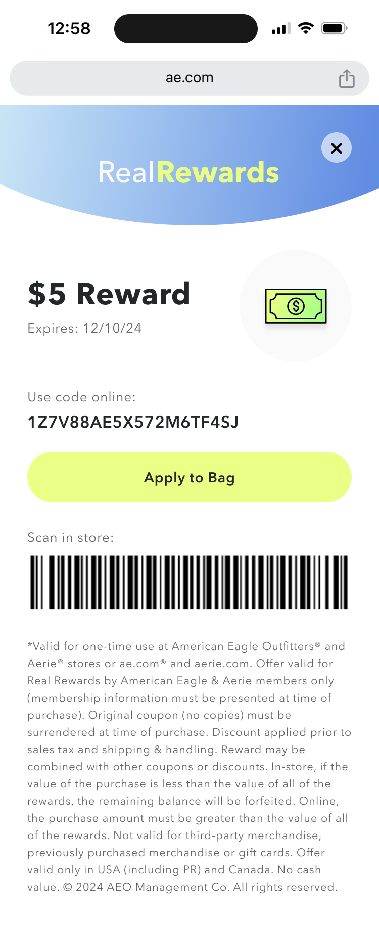
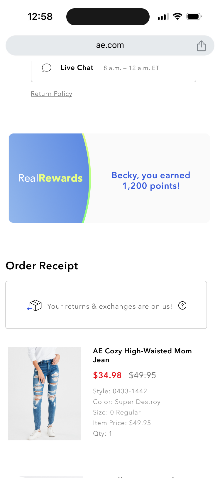
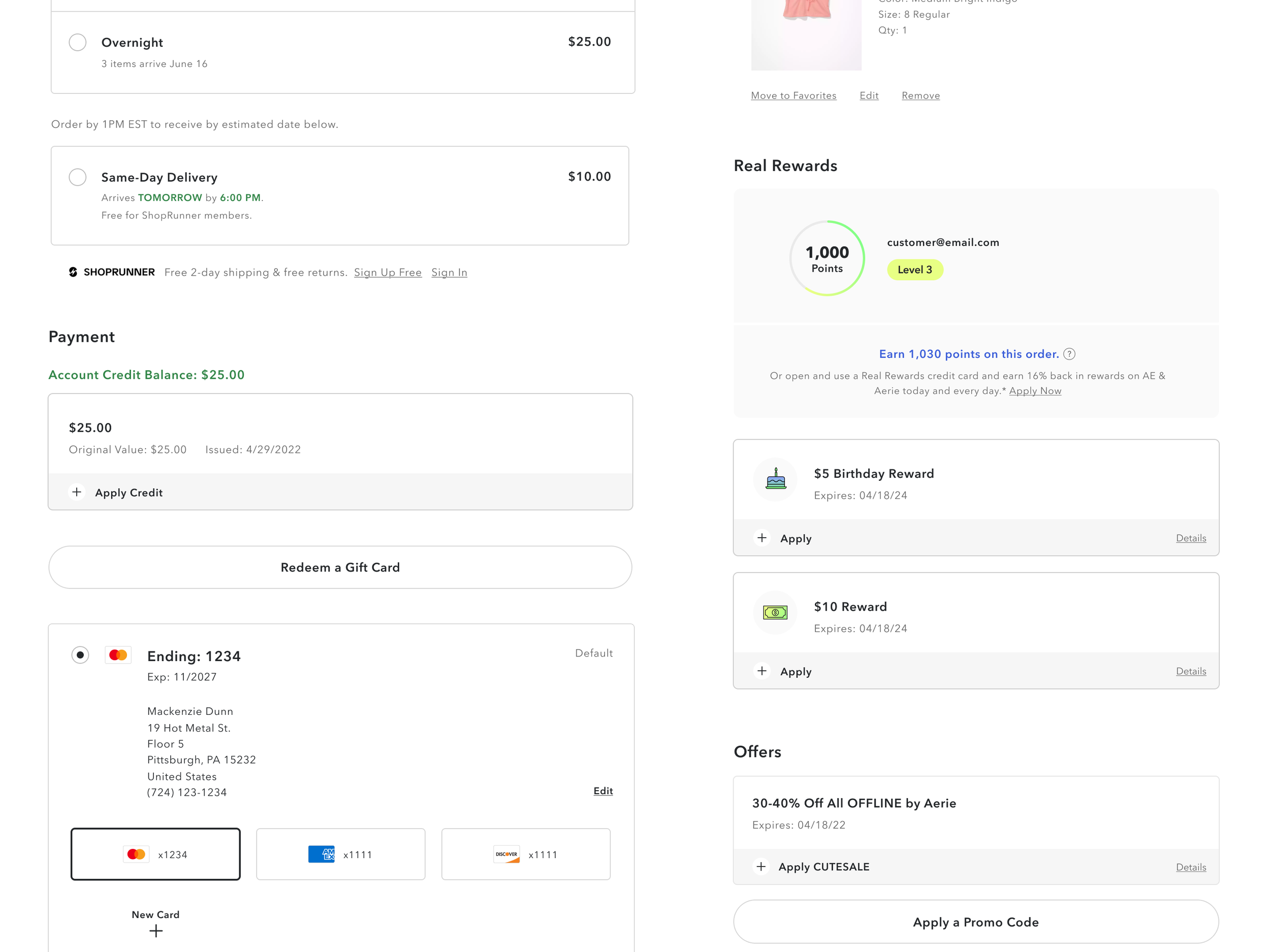
Full Web, App & Email Experiences: These updates affected nearly the entire web experience, save for the PDP. A brief list of the affected touch points include Create Account page, Dashboard, Earning History, individual reward modals, Bag, Checkout, Order Confirmation, plus a plethora of emails. You can check out the emails which are hosted in a separate page of my portfolio, here.
Loyalty Design System Refresh: With the implementation of BOPIS, my team and I completely refreshed the existing Real Rewards style guide, but kept in sync with the overarching AEO style guide (namely maintaining fonts, text stylings, base colors, etc).
With provided customer feedback and program direction already set in place by the business, AEO had a great starting point. All designers performed competitive analysis and brainstorming, and the UX team performed market research and journey mapping.
This project was designed entirely in Figma. I performed QA with my UX partner alongside developers prior to customer-facing release. Today we continue to iterate and improve on this experience.


